


Nick's Sandwich
Nick’s Sandwich Shop, a well-loved sandwich store in California, approached me to redesign their online ordering platform to improve user experience, reduce order errors, and provide a seamless delivery and pick-up process. Customers had expressed frustration with third-party food delivery platforms, citing missing customization options, outdated menu listings, and frequent order errors.
Problem Statement
Busy users don’t have a lot of time to order and wait for their food to be delivered. Many users who loves to have a sandwich from the nicks store want an individual website for nicks sandwich because they are facing problems the delivery options in other available websites of food delivery. Not only this but they want an updated options which is not showing on other websites.
Solution
To solve the issue of busy users who don't have a lot of time to order and wait for their food to be delivered I suggest designing a website for Nick's Sandwich that provides customization options for users and an easy navigation flow. This website should also include all the options that are available in Nick's Sandwich Shop, which are not currently showing on other food delivery websites. With this solution, users will be able to quickly and easily their favorite sandwiches from Nick's without any hassle.
The goal
Create a website and app that allow user to order food online with easy flow.
Responsibilities
Conducting interviews, paper and digital wireframing, low and high-fidelity prototyping, conducting usability studies, accounting for accessibility.
Project Duration
2 months
My Role
Research, Personas, Information Architeture, Wireframing, Prototyping
Team
1 UX Designer & Researcher
1 Developer
Tools used
Adobe XD
Photoshop
Adobe Illustrator
Design Process
Research
Define
Ideate
Design
Testing
-
Survey
-
Interviews
-
Persona
-
Journey mapping
-
Information
Architecture
-
Sketches
-
Digital Wireframes
-
Mockups
-
High-fidelity prototyping
-
Usability Testing
-
Iteration
Iteration
User Research Summary
I conducted user interviews, which I then turned into empathy map to better understand the target user and their needs. I discovered that many target users want indvidual website for this sandwich store like subway, jimmy-john etc. There is no individual website for this store and other webistes which are available, they do not show the availablity, updated and proper information of sandwhiches. The main frustration of user in dilevery option. I decided to design the webiste to improve the options.
Empathy Map
-
" I'm always on the go and need to quickly find what i want to order.
-
"I hate when I can't customize my order or when my customization options are limited."
-
"I want to see clear pictures of the sandwiches and ingredients so i know what i'm getting."
-
"I prefer to have the option for delivery or pick-up to fit my scheduels
SAYS
-
" I hope i can find what i'm looking for quickly without searching entire website."
-
"I don't have time to deal with technical issues and delivey issues on the website."
-
"I hope i can customize my orders to fit my preferences and dietery restrictions."
THINK
-
Impatient when website is slow or difficult to navigate.
-
Frustrated when cutomization options are limited.
-
Happy when i find what i'm looking for quickly and easily.
-
Relived when i can easily schedule a delivery or pick-up.
FEELS
-
" Scans the website quickly for the sandwich they want."
-
"Clicks on the picture to see what the sandwich look like."
-
"Customizes their order if possible."
-
Checks to see if delivery options or pick-up is available.
-
Leaves the website if it's show or doesn't meet their needs.
DOES
Persona

She experience the order was incorrect and missing several items that was placed online. After finding out the problem the problem, she came to know that it was service provider problem.
Stefani
Age: 30 years
Profession: Software Engineer
Family: 2 children
Goals
-
Sefani is busy person and want a food delivery to her location
-
She would like to have independent food delivery website for her favoriate sandwich shop.
Frustrations
-
She ordered food from two different apps and websites, but both the times she ended up twith the wrong delivery.
User Journey Map

Information Architecture

Sketches


Digital Wireframe

Catering screen button
Contact button
Home Screen button
Menu Screen button
Low Fidelity Prototype
Screen Resolution
Because users shop from a variety of devices, I felt it was important to optimize the browsing experience for a range of device sizes, such as mobile and tablet so users have the smoothest experience possible.


Usability Testing
Place order page
After payment, there is a page to place the order or confirmation page. User said they were unable to go back to the previous page .
Edit option in user profile
Users find it difficult to edit everthing including user personal informationa and delivery details.
1. For profile page, client doesn't want edit or change button for every field. I made some changes according feedback. This allowed users more freedom to go back to the previous page from place order page and no need to edit every field in profile page.

2. Based on the insights from the usability study, I made changes to improve the flow in 'place order' page and profile page. User was not able go back from place order page to previous page.
_edited.jpg)
Final Design and Prototypes
_edited.jpg)
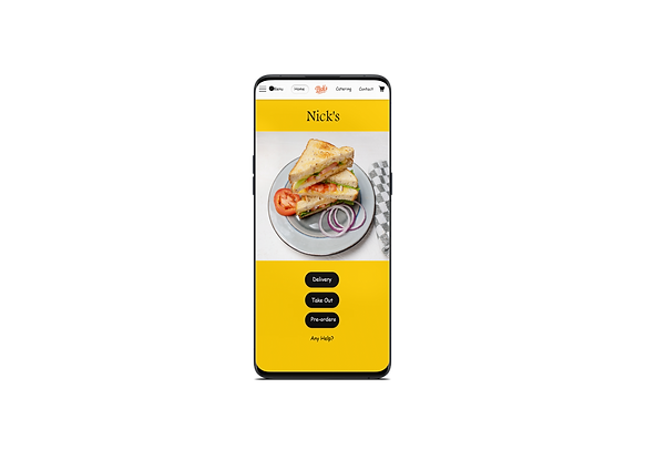
Home Screen
Order Confirmation Page
Menu Page
Customization Page
Thank you Page
Impact and Learning
Impact: Based on user feedback, the design of the app was deemed easy to navigate and understand. During usability testing, as I iterated on the mockups, users expressed satisfaction with the changes made and demonstrated an evident visual hierarchy.
What I learned:The key takeaway from user feedback and usability testing is that the design of app is successfully achieved its goal of beign easy to navigate and unterstand all visual hierarchy. I learned that even a small design change can have a huge impact on the user experience and iteration in the design process enhance the user experience.
